Project - Data Visualisation using D3.JS
05/2024
-
HTML/CSS/JS
-
Excel
-
MySQL
-
Python
Table of Contents
The Project
This project was relatively short in scope having me create 3 visualisations that answer some kind of question. Me and my team mate chose to answer whether or not life expectency was affected by alcohol consumption.
Obviosuly, no, that wasn't the case. There are many more factors that contribute to a countries medical success. This of course meant that we found no correlation to a country's life expectency and alcohol consumption.
The deployed website can be found here .
This page is my team's visual design process book (submission for the final assignment) in HTML format.
Data Processing
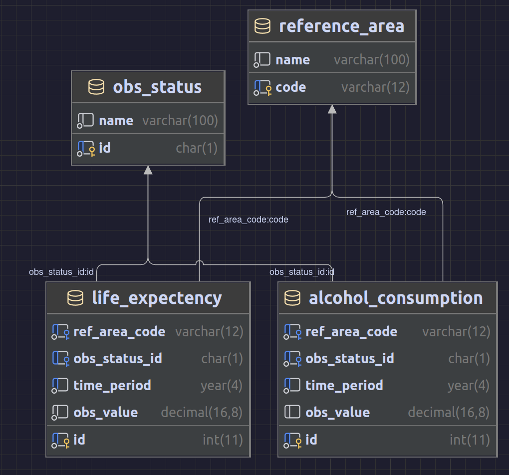
Due to the scope of the project, it was decided that creating a SQL database to process the data would be beneficial, and help us transform the data into any shope or form much quicker. Not only that, but while data was being inserted into the data into the database, the data could be cleaned and validated before it ever touched the database.
Software
After researching which DBMS (database management system) should be used for processing the data, it was decided that MariaDB should be used as it is free and open source. MySQL had some issues with licensing in the past leading to some confusion about whether or not MySQL was free as in freedom (libre). Hence, the new MariaDB team forked the MySQL source code and aims to be a drop-in replacement for it. MariaDB is actually included in the base Debian 12 bullseye repository, unlike MySQL which has to be installed through a third-party repository because of said licensing issues.
Python was used to due to its simplicity. However, upon completing the project, another language should have been considered due to Python's poor imlementation of loops, lists and other core features required to make a simple data processing program. Python is to "simple" for its own good.
Data Collection
Firstly, the team downloaded all the datasets needed to come to a decision. Bellow are the sources for each of the .csv files used:
Sadly, the requirements of the task demanded that only the data from the OECD are to be used. This means that there is a limited amount of data to work with. However, they do have huge amounts of aggregate data from all countries included .
Analysing the data
Once the data has been gathered, it was thoroughly analysed the data and stripped any un-needed columns away. This was done quickly using Excel. As a result, parsing and processing the data in Python would be made easier and potentially faster.
Some of the things noted were that some countries did not record data for alcohol life expectency, or even both for a certain time period. The reason for this could be financial or politically motivated, though it entirely depends on the country. The decision was made to simply implement some kind of data extrapolation as it could be done in code, and a warning could be included to allow the reader to to come to a decision about what to make of the data.
Here are the things that had to be done in Excel:
- Use Excel to determine which columns should be included in the final SQL database
-
Strip metadata from each record (
STRUCTURE,STRUCTURE_ID, etc.) as they aren't needed in the database
Columns dropped in
alcohol_consumption.csv
-
FREQ- Redundant, always measured anually -
MEASURE,UNIT_MEASURE,Unit of measurement- Redundant, always "alcohol consumption litres per person" -
AGE,Age- Always 15 years or over -
METHODOLOGY,Measurement method- Always not applicable -
Time period- Redundant,TIME_PERIODwas used instead -
UNIT_MULT,Unit multiplier- Always set to 0 units
Columns dropped in
life_expectency.csv
-
FREQ- Always measured annually -
Time period- Redundant,TIME_PERIODwas used instead -
UNIT_MULT,Unit multiplierAlways set to 0 units -
METHODOLOGY,Measurement methodolyg- Always not applicable -
SOCIO_ECON_STATUS,Socio-economic status,DEATH_CAUSE, -
Cause of death,CALC_METHODOLOGY,Calculation methodology,GESTATION_THRESHOLD,Gestation period threshold,HEALTH_STATUS,Health status,DISEASE,Disease,CANCER_SITE,Cancer site- Always not applicable / empty
Now that all unneccessary columns have been purged, we had to properly understand what the data we were collecting means, and how we can use it to extract meaning out of it. Thankfully, both datasets contain the column
Unit of measurement
which helped out a lot. We found that we simply cannot combine each variable into the same chart and axis as they are different measurements (alcohol consumption in litres per person, and life expectancy). Though, they did have one thing in common: year. This meant we could at least compare both value's trends overtime.
Processing the data in Python
The Python script does a few things:
-
Establishes a connection to the MariaDB database on the Debian virtual machine, using the python-mariadb-connector Python package
Python - Connect to MariaDB database
try: connection = mariadb.connect( user="foo", host="bar", port=3306, ) Except mariadb.Error as e: Print("Mariadb error: " + e) Sys.exit() cur = connection.cursor() -
Create all tables in the database using the mariadb python package
-
Open the
alcohol_consumption.csvdataset, loop through all lines, and repeat for other datasetsPython - Connect to MariaDB database
          ref_area_codes = {}
obs_status_codes = {}

def time_preiod_mariadb_format(time) -> datetime.datetime:
    split = time.split('-')
    return datetime.datetime(int(split[0]), int(split[1]), 1)

def insert_ref_area_if_not_exists(db_cursor: mariadb.Cursor, ref_area_code, ref_area_name):
    if ref_area_code not in ref_area_codes:
        db_cursor.execute("insert into reference_area(code, name) values(?, ?)", (ref_area_code, ref_area_name))
        ref_area_codes[ref_area_code] = ref_area_name

def insert_obs_status_code(db_cursor: mariadb.Cursor, obs_status_id, obs_status):
    if obs_status_id not in obs_status_codes:
        db_cursor.execute("insert into obs_status(id, name) values(?, ?)", (obs_status_id, obs_status))
        obs_status_codes[obs_status_id] = obs_status
with open(dataset_alcohol_consumption, "r") as f:
    lines = f.readlines()
    line_c = len(lines)
    index = 0

    print(f"\nParsing {str(line_c)} records in ALCOHOL CONSUMPTION dataset")
    for row in lines:
        if index == 0:
            index += 1
            continue

        if row.strip() == '':
            continue

        records = row.split(',')
        ref_area_code = records[0]
        ref_area_name = records[1]
        time_period = records[2]
        obs_value = records[3]
        obs_status_id = records[4]
        obs_status_name = records[5]

        insert_ref_area_if_not_exists(cur, ref_area_code, ref_area_name)
        insert_obs_status_code(cur, obs_status_id, obs_status_name)
        cur.execute("insert into alcohol_consumption(ref_area_code,
        obs_status_id, time_period, obs_value) values(?, ?, ?, ?)", (ref_area_code,
        obs_status_id, time_period, str(obs_value)))
        index+=1
Querying the Database
Now that everything has been inserted into the database, we can execute simple SQL queries to get any kind of data we want. We will discuss the visualisations in the next section, but table 5 shows an example query that was used to create the stacked area chart:
       DROP VIEW IF EXISTS times;
CREATE VIEW times AS
SELECT alcohol_consumption.time_period FROM alcohol_consumption
UNION SELECT life_expectency.time_period FROM life_expectency
SELECT reference_area.name, times.time_period, life_expectency.obs_value as life_expectency
FROM reference_area
CROSS JOIN times
LEFT JOIN alcohol_consumption ON reference_area.code = alcohol_consumption.ref_area_code AND times.time_period = alcohol_consumption.time_period
LEFT JOIN life_expectency ON reference_area.code = life_expectency.ref_area_code AND times.time_period = life_expectency.time_period
ORDER BY reference_area.code, times.time_period;
With this one simple trick, the data can be manipulated to get any kind of output very easily, and be generally fast (Power-BI users will hate this)! You can see how in this query, the
times
view was
CROSS JOIN
ed into the
alcohol_consumption
table. The
times
view is combining all years that are present in each dataset into a temporary table that could then be used. Then, the developer can
CROSS JOIN
it in the
reference_area
table and return a dataset containing each country, alcohol consumption and life expectancy for each year.
Because the query performs a
left join
the
life_expecancy
and
alcohol_consumption
table, we will get some null data. Again, as mentioned before, The D3 website will extrapolate the data in order to fill in the gaps.
Once the SQL query was executed, it could then be exported into a
.csv
file to then be turned into a visualisation in D3.
| name | code | time_period | alcohol_consuption | life_expectency |
|---|---|---|---|---|
| Argentina | ARG | 2010 | 8.2 | |
| Argentina | ARG | 2011 | 7.7 | |
| Argentina | ARG | 2012 | 8 | |
| Argentina | ARG | 2013 | 8.3 | |
| Argentina | ARG | 2014 | 7.9 | |
| Argentina | ARG | 2015 | 8.5 | 76.8 |
| Argentina | ARG | 2016 | 8.4 | 76.8 |
| Argentina | ARG | 2017 | 8.3 | 76.3 |
| Argentina | ARG | 2018 | 8 | 76.8 |
| Argentina | ARG | 2019 | 8 | 77 |
| Argentina | ARG | 2020 | 75.3 | |
| Argentina | ARG | 2021 | 75.9 | |
| Argentina | ARG | 2022 | 75.4 |
Extrapolation
The data had to be extrapolated because it would make the chart borderline unreadable. Also, upon analysing the data, with our initial line chart. Life expectancy and alcohol consumption in most countries show a mostly linear, downward trend. This means that by using the extrapolation function as shown in Table 7, we won’t be too far off. Although it is worth noting that other political events during those times may affect the validity of the data, a tooltip should be added to notify the user that this data point is estimated. The formula provided by the stack exchange post by TecHunter *(which was sourced from a post from classroom.synonym.com ) to find the slope of the dataset. Below is the formula used to calculate the slope ($$$y$$$ increases as $$$x$$$ increases by one year), which we use to fill in the gaps:
$$$\text{slope} = \frac{n \sum (xy) - \sum x \sum y}{n \sum x^2 - \left(\sum x\right)^2}$$$
le_ac_chart.js
-
source
/**
 * Fills null data by calculating trendline of existing data, and using extrapolated data to fill it in
 * @param {Array} data
 * @param {string} The index of the y axis to calculate the extrapolated values for
 * @param {string} An optional string that when set to something, will acces data[i]["isEstimated"] and flip to true if it was
 *  modified during the function
 */
function fillMissingData(data, yAxisParameter, isEstimatedParameter) { // Formula from: https://math.stackexchange.com/a/204021

    // KEY TERIMNOLOGY:
    // [null, null, *6*, 8, 3, **9**, null, null ]
    //    - LEFT MOST:  *6*
    //    - RIGHT MOST: **9**

    // 1. We want to find the left most value, and loop for all other null values until reach index 0
    // 2. Find right most value, loop until reach index (size of array)
    // 3. Calculate `y = mx` (no `+c`, we only want gradient)
    //    1. Calculate slope of equation `m`
    //    2. Calculate offset `c`

    let leftMostIndex = -1;
    let rightMostIndex = -1;
    for (let i = 0; i < data.length; i++) {
        if (leftMostIndex == -1) {
            // We have not found the left most index, meaning we should loop until we find it
            if (data[i][yAxisParameter] != null)
                leftMostIndex = i
        } else {
            // We have found it, so we'll need to find the right most index
            // Loop until the next number is either a stack overflow, or null
            if (i == data.length - 1)
                rightMostIndex = data.length
            else if (data[i + 1][yAxisParameter] == null)
                rightMostIndex = i

            if (rightMostIndex != -1) break // We found one. Nicer than having 'break' in each 'if elseif' statement imo
        }
    }

    // THIS COULD BE BAD
    // rightMostIndex + 1 seems like something that should not be done
    // (Could cause a stack overflow exception)
    const dataSubset = data.slice(leftMostIndex, rightMostIndex + 1)
    const dataRise = calculateSlopeOfDataset(dataSubset, (d) => d[yAxisParameter])

    // This loop starts the left most value, and loops unitl the index = 0. Since we want to calculate the extrapolated value using
    // the linear equation we created, we can keep a store of the current X and Y, then for each index, subtract rise and run and set
    // that data point's life expectency to it

    if (leftMostIndex != 0) {
        let d = data[leftMostIndex]
        let currentY = d[yAxisParameter]
        for (let i = leftMostIndex - 1; i <= 0; i--) {
            // We are going backward, so subtract
            currentY -= dataRise
            data[i][isEstimatedParameter] = true
            data[i][yAxisParameter] = currentY
        }
    }


    if (rightMostIndex < data.length) {
        d = data[rightMostIndex]
        currentY = d[yAxisParameter]
        for (let i = rightMostIndex + 1; i < data.length; i++) {
            currentY += dataRise
            data[i][isEstimatedParameter] = true
            data[i][yAxisParameter] = currentY
        }
    }
}

/**
 * Calculates the slope of Y in a dataset. Formula from - https://math.stackexchange.com/a/204021
 * @param {Array} data The sliced dataset, containing NO null/NaN values
 * @param {Function} A function that takes each data point as an argument, to return which value to use. Null to just use that value
 */
function calculateSlopeOfDataset(data, func) {
    let sumOfX = 0
    let sumOfXSquared = 0
    let sumOfY = 0
    let sumOfXMultY = 0 // summtion (x * y)
    let n = data.length
    for (let i = 0; i < n; i++) {
        const d = data[i]
        const x = d.timePeriod.getFullYear()
        const y = func(d) ?? d

        sumOfX += x
        sumOfXSquared += x * x
        sumOfY += y
        sumOfXMultY += x * y
    }

    return (n * sumOfXMultY - sumOfX * sumOfY) / (n * sumOfXSquared - (sumOfX * sumOfX))
}
Visualisation Design
For the effective communication of the message that was to be conveyed, appropriate visualisations were needed. So, visualisations were proposed, and 3 were selected that best encoded the data that that was collected. After there had a few datasets,Edward Tufte's Design Princaples
Tufte’s design princaples are a list of design decisions that the designer must make when creating their visualisation. In this case, his decisions were put into consideration. Bellow are some of the princaples that were applied. The reader is advised to familiarise themselves with them before reading on.-
Data/Ink Ratio
Remove non-essential elements from visualisations to ensure that as much of the screen presents some kind of data/information.
-
Comparisons, contrasts, and differences
Viewers should be lead to comparing data points easily.
-
Small Multiples
Instead of a single, complex chart, the design should be split into multiple.
-
Integrate text and visuals
Use labels, annotations, and other legends to provide context and improve understanding of the data.
-
Provide detailed, high resolution data
Do not trim/dumb-down the visualisation to make it easier to understand.
-
Tell a story
Lead your audience to a more thorough understanding of the data through some kind of narative.
-
Respect integrity of data
Do not distort or manipulate data to fit some kind of narative or agenda, also known as the lie factor .
-
Encourage exploration and interaction
Immerse your audience with clickable buttons, hover effects, and other helpfultools to help them analyse the data for them selves. .
Scrapped Ideas
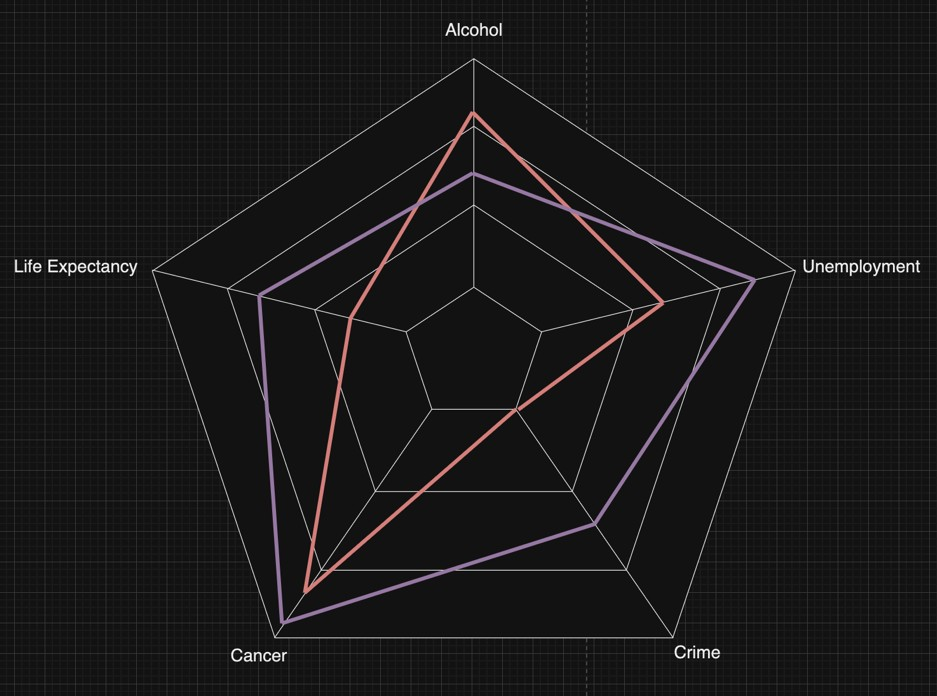
Radar Chart
This visualisation intends to make displaying multiple data points at once.
While sketching up different visualisations, one of the first charts we thought of was a radar chart. This chart makes it easy to compare each variable against each other country, and by design, also makes it easy to find causality between variables. This chart does not show any other documentation that would be included such as the country name, drop-down for each country, etc... but if it were to be implemented, we would include them. We use hue to distinguish each country from each other on the radio chart, allowing users to select multiple countries and clearly see which one is which. By design, this chart integrates multiple variables (life expectancy, cancer, crime, unemployment, and alcohol consumption) together for the audience to form an opinion.
It was decided that we shouldn’t use it due to it’s complexity to program. It could be done, but we felt as if it would take too much time to do under the strict deadline.
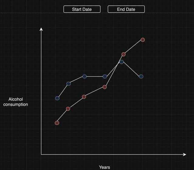
Line Chart
The interactive line chart above illustrates the trends in alcohol consumption over the various years. At the top of the visualisation, the user can decide the start and the end date that the visualisation covers. Along the x-axis, years are plotted, and the y- axis has the amount of alcohol consumed during those years. When hovered over, the exact amount of alcohol consumed and the corresponding year. This would show the trend in countries and the ability to compare different countries. When clicked, it would show a pie chart that compares the ratio of male drinkers to female drinkers in the country in that given year.
To elaborate, this allows the user to find any causations between each country. It is multivariant as the user can select which countries they want to select and has adequate context for the data points to be compared against. This will be one of the charts we consider for our final website.
Selected Visualisations
First Visualisation - Choropleth map of average alcohol consumption
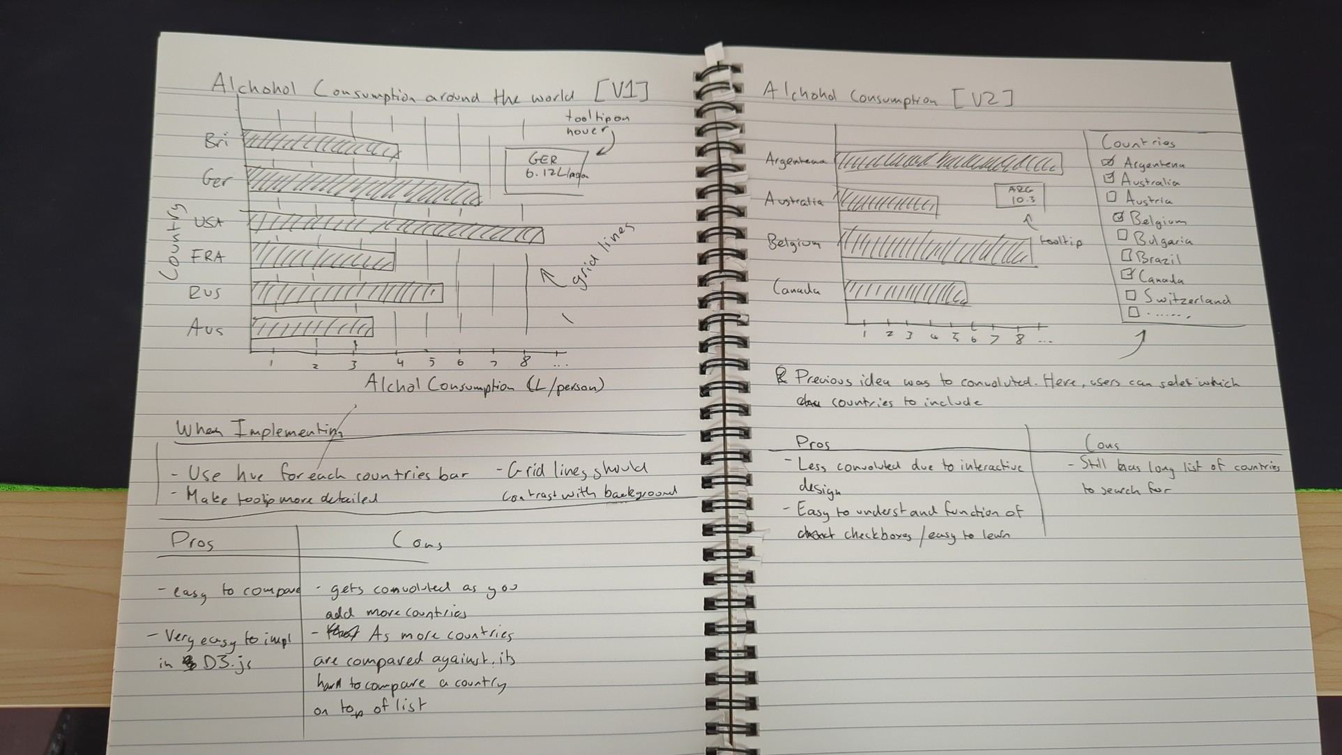
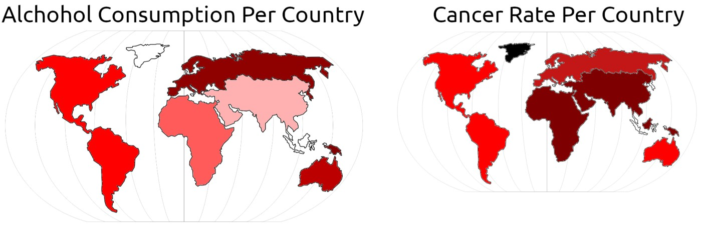
The goal of this visualisation is to give the audience an overall view of alcohol consumption on a map.Initial sketch of bar chart [Version 1 and 2]
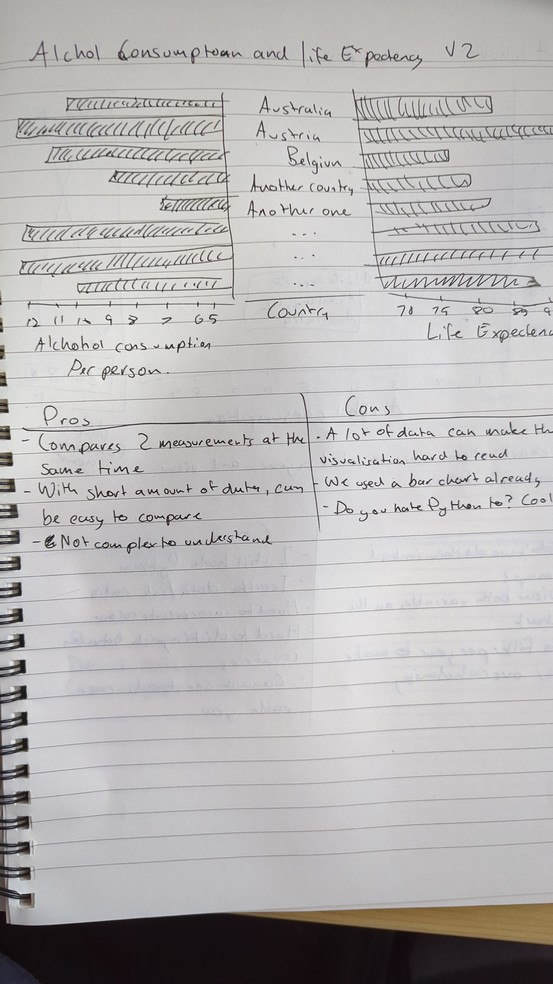
Our vision was to start simple and build upon the ideas we start with. The sketch shows the two visualisations created. This section will talk about version 1, on the left page. As you can see, we started off with a simple bar chart, known for its good data/ink ratio, and can easily be modified to include axis lines, tooltips, etc thanks to D3. However, no matter what we try, there are simply too many countries to to include. Even if we were to add checkboxes as shown in Version 2, it would be a nightmare to scroll through if all you need is alcohol consumption. So, we thought of some other ideas for representing this data. Some of the ideas here would eventually be incorporated in other charts.
| Pros | Cons |
|---|---|
|
|
In conclusion, while this chart is very simple, it does not accomplish the goal it sets out to accomplish of allowing the audience to see every country’s alcohol consumption.
Choropleth [Version 3] Sketch
Our second idea was to create a choropleth map. Its simple design makes interacting with the map and finding the data points you need easy, intuitive, and engaging. Upon that, it also allows users to compare against different countries at once. However, to show multiple variables, it must be split in 2, but that won’t be necessary.
Due to its simplicity, it easily accomplishes the goal as discussed above, so we decided to use this and make some modifications during the development phase, discussed in the next section.
Final product of Choropleth
We landed on the visualisation containing a choropleth of global alcohol consumption. After implementing it, we have made some changes to how we designed the chart, so we will talk more about it here.
This final visualisation is a choropleth map that depicts the average alcohol consumption per person across the world. The map uses a color gradient/hue shift from light beige to dark red and represents the level of alcohol consumption ranging from the least(1 liter per person) to the most(14 liters per person). Countries with no available data are marked as light gray (HTML white smoke), as per one of Tufte’s design princaples.
The map allows users to hover over different countries in the map to show the exact value of alcohol consumption per person enhancing user interaction and providing more accurate data on demand to avoid any significant lie factors.
Going back to the color gradient, it is a good way of representing quantitative data at a glance and comparison is easy and clear. A choropleth map is perfect for this type of data because it provides a clear geographical distribution of alcohol consumption rates across different countries. This also allows the reader to see patterns within an area. For example, we can say that alcohol consumption in Russia is higher than that of China and the alcohol consumption of different European countries is close to one another.
These are factors that Tufte recomends visualisations incorperate. A visualisation should allow the reader to sift through the data and form opinions based on what is shown.
Second Visualisation - Bar chart for top 10 alcohol consumers
We were trying to analyze the data to find any correlation between data points. We did not find much just by pointing and clicking at different countries. So, we decided to make a quick visualisation in Datagrip to show us the max, min, and median alcohol consumers, to which we found Russia as the maximum alcohol consumer, Turkey to be the least, and New Zealand to be the median. We used those countries to see if there was even a little bit of correlation. Below is the table generated from the SQL query showing the countries with the least alcohol consumption:
try:
SELECT
    reference_area.name AS 'ref_area_name',
    reference_area.code AS 'ref_area_code',
    alcohol_consumption.obs_value AS 'average_alcohol_consumption',
    life_expectency.obs_value AS 'average_life_expectancy'
FROM
    reference_area
CROSS JOIN
    times
LEFT JOIN
    alcohol_consumption ON reference_area.code = alcohol_consumption.ref_area_code AND
    times.time_period = alcohol_consumption.time_period
LEFT JOIN
    life_expectency ON reference_area.code = life_expectency.ref_area_code AND
    times.time_period = life_expectency.time_period
WHERE
    times.time_period = 2019
ORDER BY
    alcohol_consumption.obs_value DESC
LIMIT
10| ID | Ref Area Code | Time Period | Alcohol Consumption (liters per person) | Life Expectancy (years) |
|---|---|---|---|---|
| 1 | CZE | 2019 | 11.9 | 79.3 |
| 2 | AUT | 2019 | 11.6 | 82 |
| 3 | LVA | 2019 | 11.6 | 75.7 |
| 4 | FRA | 2019 | 11.4 | 83 |
| 5 | LTU | 2019 | 11.1 | 76.5 |
| 6 | LUX | 2019 | 11 | 82.7 |
| 7 | RUS | 2019 | 10.8 | 73.2 |
| 8 | HUN | 2019 | 10.7 | 76.5 |
| 9 | DEU | 2019 | 10.6 | 81.3 |
| 10 | EST | 2019 | 10.4 | 79 |
The visualisation focuses on the top 10 countries in terms of alcohol consumption in 2019 and compares their alcohol consumption rates and the difference in life expectancies across the countries. This visualisation was chosen to represent two different variables across the ten countries highlighting how the amount of alcohol consumed influences the life expectancy of the population. Each bar represents a country, coded by its country abbreviation, and displays the average liters of alcohol consumed per person. Additionally, the life expectancy for each country is overlaid on the y-axis using a gradient to represent the life expectancy of the different countries ranging from 72 with the lowest saturation of blue to 85 with the highest saturation of blue. Like in the first visualization, data on demand is provided when the different bars are hovered over. The full name of the country, exact alcohol consumption value, and exact life expectancy values are displayed to similarly avoid any significant lie factors.
A bar chart was chosen as it is the most effective for comparing quantitative values. In this case, it facilitates easy comparison of alcohol consumption rates. Also, the bars are colored in a spectrum that represents the life expectancy of the top ten countries in terms of alcohol consumption. The use of two different variables also facilitates easy comparison to see a correlation between the two. Additionally, ordering of the bars according to alcohol consumption or life expectancy is a feature of the visualisation to help see any patterns in the data to allow the user to interact with the chart more thoroughly to make conclusions more rapidly, without having more ink than data, as this is something that Tufte is concern about with visualisations.
Third Visualisation - Stacked Area Chart
Iteration Designs
1 st Iteration - Dual Column Chart
This design takes two variables, alcohol consumption per person, and life expectancy and combines them side by side in a dual-column chart. This means the reader can search through the list of countries to find what they are looking for, and they can see both. The design has more way too much data (in terms of data/ink ratio), which can become overwhelming. This was also discussed in 1st visualisation’s first iteration. The solution for that would be to incorporate a scroll bar with a bunch of countries which would work much better here, but there is something that won’t work about this. There is simply no room to compare them over time. So we had to scrap this one.
Sadly, it has more way too much data (in terms of data/ink ratio), which can become overwhelming. This was also discussed in 1st visualisation’s first iteration. The solution for that would be to incorporate a scroll bar with a bunch of countries which would work much better here, but there is something that won’t work about this.
There is simply no room to compare them over time. So we had to scrap this one.
2 nd Iteration - Scatter Plot
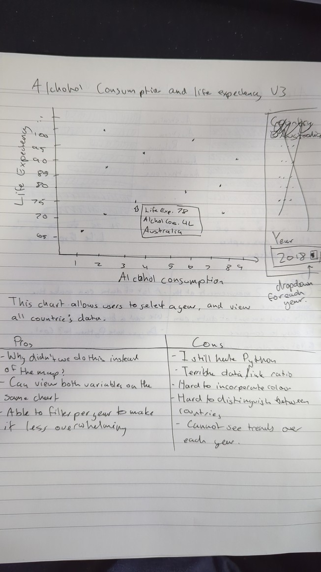
The scatter plot has a very similar problem as the dual column chart, it does introduce a much simpler UI instead of the convoluted dual bar chart solution. This one instead has a dropdown where you can select througheach year, with the $$$x$$$ and $$$y$$$ axis being life expectancy and alcohol consumption respectively.
This chart is simply bad though, each variable has different measurements, and would make no sense to be put on a different axis. The fact is, is that life expectancy and lcohol consumption are dependent on the year, meaning it cannot be put on a scatterplot by definition.
Depending on how many countries there are, this chart could have a bad data/ink ratio and makes it hard to incorporate any kind of color, thus making it hard to abide by Tufte’s design princaples. This does depend on how the circles/data points are designed, but no matter what happens, this simply won’t be good enough. Tufte is not impressed.
Iteration - Stacked Area Chart
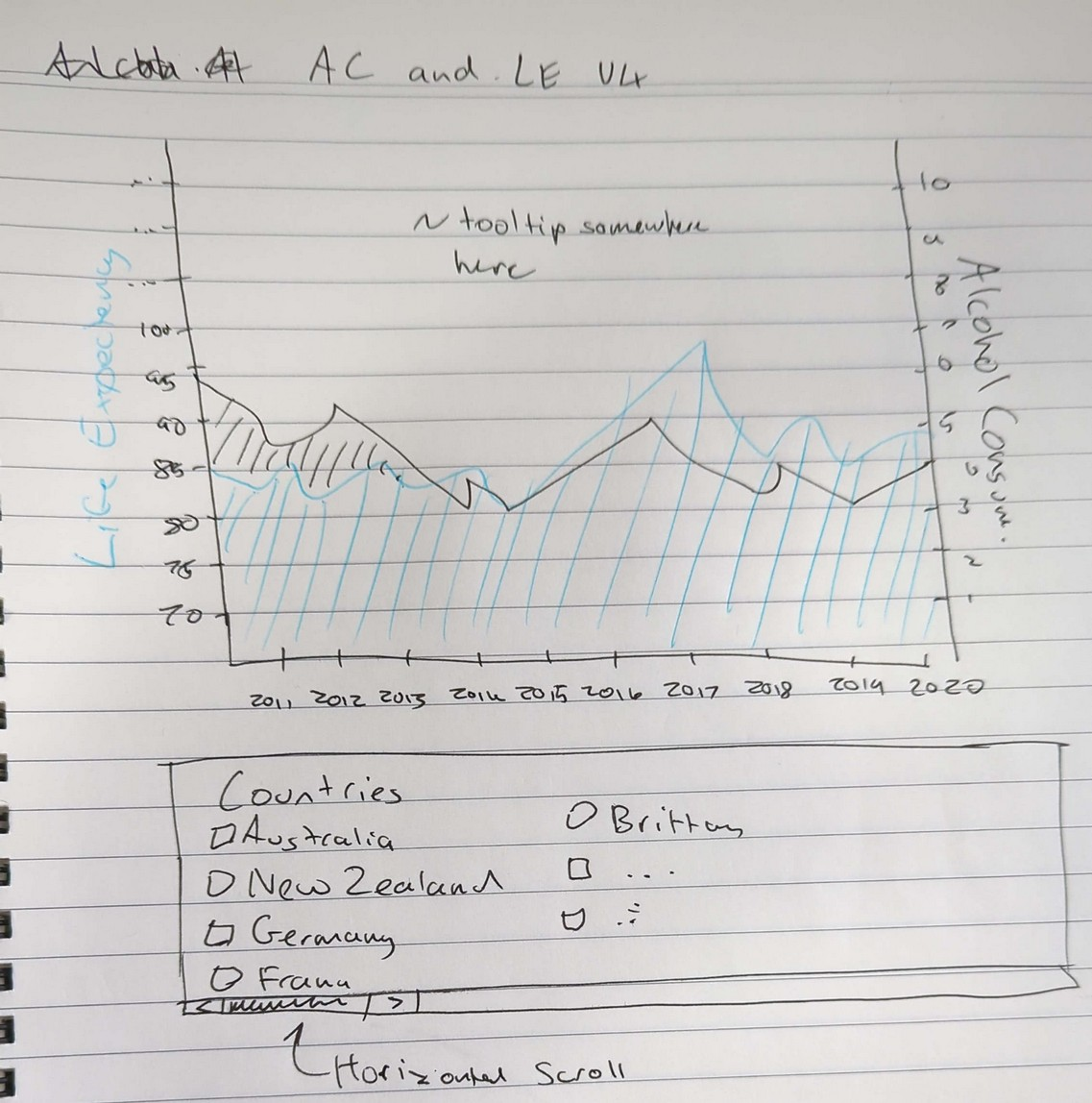
Thes stacked area chart is the design we stuck with. It combines both life expectancy and alcohol consumption together, along a common $$$x$$$ axis of time. It allows users to select from a range of countries to filter which ones they’d like to look at. Upon that, it allows the user to view the trend of a country’s life expectancy and alcohol consumption to see if there is any trend.
Final Design
The interactive time series chart here tracks alcohol consumption (liters per person) and life expectancy over a period of time (2010 – 2021) in the selected country. This graph combines life expectancy and alcohol consumption together as a stacked area chart. Changes in life expectancy and alcohol consumption can be compared with ease using the third visualisation helping to find a correlation between alcohol consumption and life expectancy, thus allowing the reader to find any causations between the data points (if any).
Like the other visualisations, this graph also has a hover feature that shows the exact amount of alcohol consumed and the life expectancy each year of the selected country. As discussed in the data processing section, it was found that some countries don’t have recorded data in some years, so any missing values were extrapolated to make the chart look better and provide estimates for empty values that could otherwise be problematic for the overall design. To ensure this chart is up to Tufte’s standards the lie factor is minimised, a legend was incorporated to show which data points are extrapolated.
Upon that, it allows the user to choose which data to show (life expectancy and alcohol consumption on sidebar).
Conclusion
Throughout the course of the project, our team embarked on an extensive iterative design process to determine the most effective methods of visual representation for the data that was curated on alcohol consumption and life expectancy. The journey through various visualisation designs included exploring an array of different visualisation types, each contributing to our understanding of the best visualisation practices in data visualisation.
After careful and multiple iterations, we finalized a set of visualisations that clearly articulated the relationship between the data. Each selected visualisation was tailoredto highlight specific aspects of data, ensuring clarity and ease of understanding for the audience. The tools not only facilitated understanding of the trends and patterns but also enhanced the interactive experience, allowing users to engage deeply.
Our analysis focused on comparing life expectancy with alcohol consumption across various regions and over time. Contrary to expectations, our observations revealed that there is no significant correlation between alcohol consumption and life expectancy. This conclusion underscores the complexity of public health data and suggests that multiple factors influence life expectancy, with alcohol consumption not playing a pivotal role as hypothesized. The insights are valuable for researchers, policymakers, and public health professionals, providing a nuanced understanding of the factors that impact life expectancy.
